Brand & Design System
The complete design language for corey.co — assets, colors, surfaces, image treatments, motion, and wallpapers. Use them for press, partner materials, or building anything that should feel like this site. Also available as design.md for agents and LLMs.
Logo
The CH monogram is the primary logo mark. Use it wherever the brand needs to be identified at a glance.
CH Monogram — Light
CH Monogram — Dark
C Mark

Text Wordmark
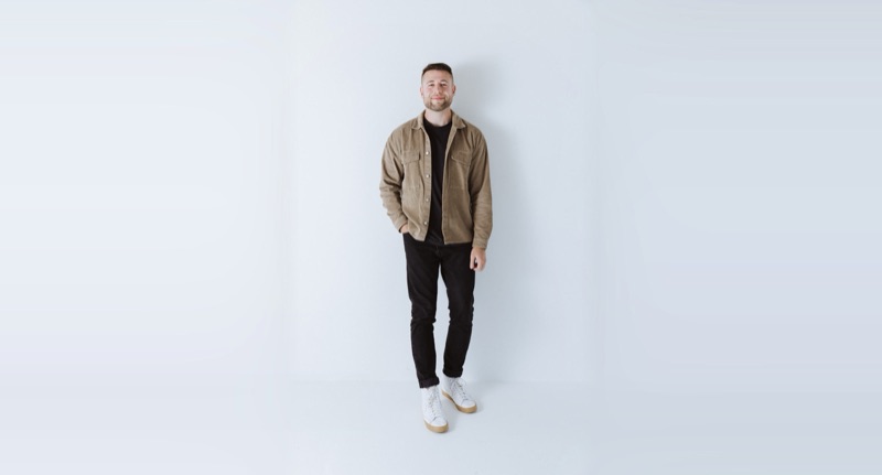
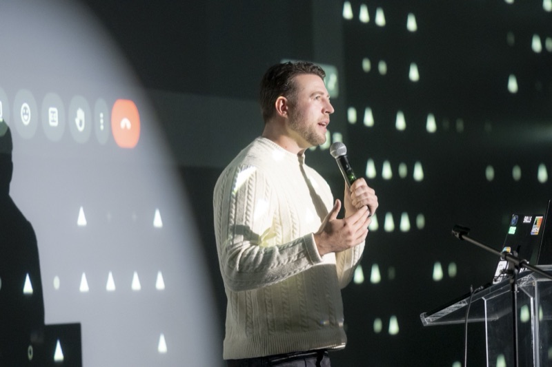
Headshots
Approved headshots for press, speaking events, and partner materials. Right-click to save or use the download links below.

Close-up — Square

Smiling — Square

Front-facing — Square
Media Kit
Bios, topics, and quick facts for podcasts, press, and speaking introductions.
Short Bio
Corey Haines is the founder of Conversion Factory, a marketing agency for B2B SaaS, and the creator of Marketing Skills, an open-source AI agent toolkit for marketers. He's bootstrapped five SaaS startups and worked with 100+ companies.
Long Bio
Corey Haines is a marketer and builder who's bootstrapped five SaaS startups and worked with 100+ companies. He runs Conversion Factory, a marketing agency for B2B SaaS, and built Marketing Skills — an open-source AI agent toolkit that turns marketing expertise into repeatable, AI-runnable workflows. He also writes SwipeFiles, a newsletter read by 30,000+ marketers and founders. His work focuses on AI-native marketing: building content, SEO, and growth systems that compound — and encoding marketing know-how into skills that teams and agents can run on demand.
Topics & Expertise
Quick Facts
Title
Founder
Companies
Location
San Diego, California
Newsletter
SwipeFiles (30,000+ subscribers)
Previously Spoken At
Vercel, MicroConf, Ahrefs Evolve
Social Links
Colors
A neutral, refined palette that lets the work speak for itself. Click any swatch to copy its value.
Core Palette
UI Gradients
Hover Accent Gradients
Colorful gradients appear on card borders during hover. Any gradient can be used for any section or component. Hover the cards below to preview.
Hover me
Sunset
Red → Orange → Yellow
Hover me
Emerald
Green → Teal → Cyan
Hover me
Twilight
Blue → Violet → Pink
Hover me
Neon
Cyan → Blue → Magenta
Hover me
Coral
Rose → Pink → Fuchsia
Hover me
Ocean
Indigo → Blue → Cyan
Hover me
Citrus
Yellow → Lime → Green
Hover me
Aurora
Teal → Indigo → Violet
Hover me
Amber
Orange → Amber → Gold
Hover me
Peach
Salmon → Pink → Apricot
Hover me
Cosmos
Purple → Violet → Indigo
Hover me
Prism
Red → Cyan → Yellow
Surfaces
Every card is a three-layer sandwich: a resting silver frame, an accent gradient revealed on hover, and a white content well. The 12px padding (p-3) is what turns the gradient layers into a border.
The card recipe
Hover to reveal the accent layer
<div class="group relative overflow-hidden rounded-3xl p-3">
  <!-- 1. resting silver frame -->
  <div class="absolute inset-0 bg-gradient-to-b
       from-[#fcfcfc] to-[#b9b9b9]
       transition-opacity group-hover:opacity-0" />
  <!-- 2. accent gradient revealed on hover -->
  <div class="absolute inset-0 opacity-0
       transition-opacity group-hover:opacity-100"
       style="background: linear-gradient(
         to bottom, #3b82f6, #8b5cf6, #ec4899)" />
  <!-- 3. white content well -->
  <div class="relative rounded-xl border
       border-black/15 bg-white">…</div>
</div>
Image Treatments
Two signature photo treatments: a warm light-leak screened over images, and a metallic ring around circular avatars.
Warm Light-Leak
Original
Light-leak applied
mix-blend-mode: screen;
background:
  radial-gradient(ellipse at 85% 15%,
    rgba(255,120,100,0.4) 0%, transparent 50%),
  radial-gradient(ellipse at 10% 80%,
    rgba(255,200,100,0.2) 0%, transparent 50%),
  radial-gradient(ellipse at 50% 50%,
    rgba(255,255,255,0.1) 0%, transparent 70%);
Metallic Avatar Ring
background: linear-gradient(
  to bottom, #999, #4d4d4d);
padding: 4px;
box-shadow:
  inset 0 8px 8px rgba(255,255,255,0.5),
  inset 0 -8px 8px rgba(77,77,77,0.2);
Gradient Ring — Active

The metallic ring's active state — the 12 accent gradients crossfade around the avatar on the 24s cycle.
Gradient Halo
Gradient border with a soft blurred halo — the wallpaper “lit card” treatment applied to a photo.
Silver Frame
Photos sit inside the resting silver card border — the default treatment for headshots and project shots.
Status Chip
Frosted white pill with a status dot, floated over imagery — used on project cards.
Interaction Patterns
Animated patterns that define the brand's interactive language across the site.
Animated Gradient Cycling
On hover, card borders cycle through all 12 accent gradients with a smooth crossfade. Each card starts at a random offset so adjacent cards don't sync.
Project Alpha
Hover to see cycling gradient
Case Study
Hover to see cycling gradient
Latest Post
Hover to see cycling gradient
2s per gradient, 24s full cycle, hash-based random start offset per instance
Cursor Shimmer
A soft radial glow follows the cursor across card surfaces on hover, adding depth and interactivity. Move your cursor across the cards above to see it in action.
Pill Buttons
Action buttons feature a spinning conic gradient border that cycles through all accent colors on hover. The inner pill stays white. Each button starts at a random phase.
Motion
Motion is soft and physical — small translates, gentle scales, long crossfades. Nothing snaps. Click a token to copy it.
Duration & Easing Tokens
Section content
Scroll Reveal
700ms ease-out, fade + rise 2rem
Slide Enter
350ms cubic-bezier(0.22, 1, 0.36, 1)
Hover transforms: cards lift 4px (-translate-y-1), buttons scale to 1.02 and press to 0.98, inline images zoom to 1.05–1.10. Sections fade in and rise 2rem the first time they scroll into view.
Typography
Geist Sans for headings and body. Geist Mono for code and technical content.
Geist Sans — Primary
Aa
H1 — 56px / Medium
Section Heading
H2 — 24px / Medium
Body text looks like this. Clean, readable, and light.
Body — 18px / Light
Small text for captions and labels.
Small — 14px / Regular
Geist Mono — Code
Aa
Used for code blocks and technical content
ABCDEFGHIJKLMNOPQRSTUVWXYZ
abcdefghijklmnopqrstuvwxyz
0123456789
Wallpapers
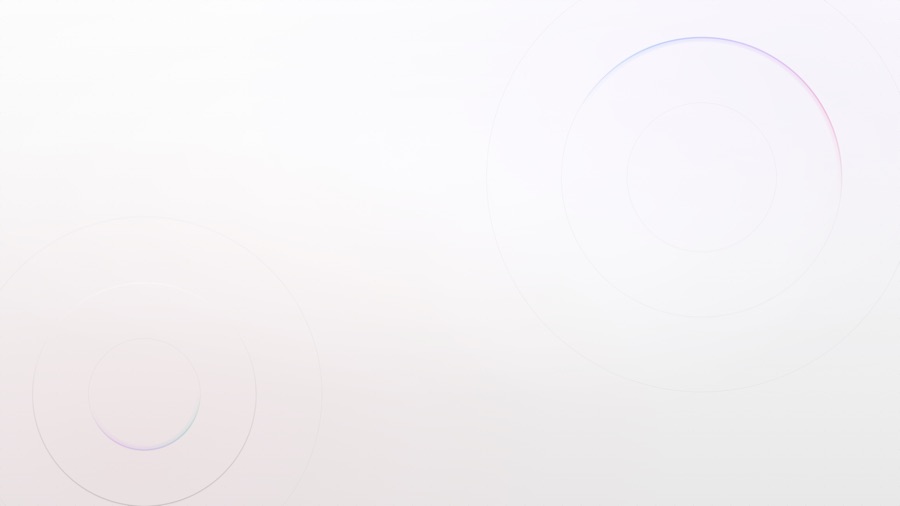
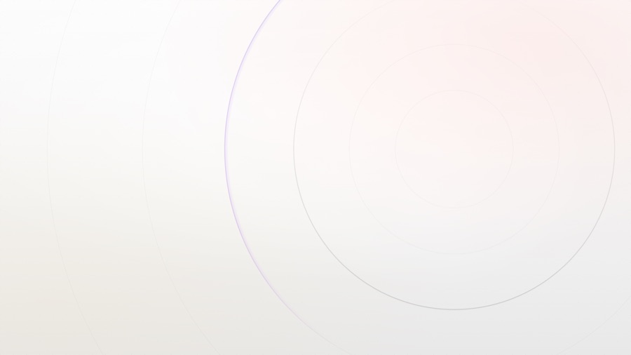
Desktop wallpapers built from this design system — hairline rings, gradient arcs, and pill bars on the silver base. 6K resolution (6016×3384), free to use. Click a card to download.

Orbits
Concentric hairline rings with Twilight and Peach gradient arcs

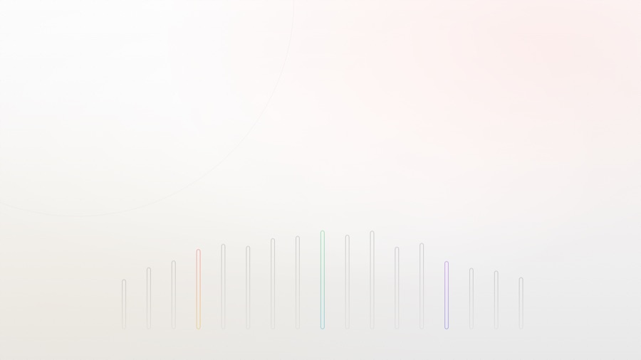
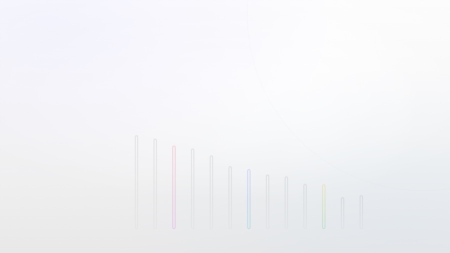
Reeds
Vertical gradient pill bars rising from the bottom edge

Haze
Minimal corner arcs with a whisper of Peach
Ten More Variations


Each opens a live generator that renders at your window size — screenshot at any viewport for custom resolutions.
Usage Rules
Keep the brand looking its best by following these guidelines.
Do
- +Use the logo on white or very light backgrounds
- +Invert to white when placed on dark backgrounds
- +Maintain clear space equal to the height of the “C” around the logo
- +Keep the logo at a minimum size of 24px
- +Use the provided brand colors
Don't
- –Stretch, skew, or distort the logo
- –Recolor the logo with non-brand colors
- –Add drop shadows, gradients, or effects to the logo
- –Place on busy or low-contrast backgrounds
- –Rotate or crop the logo
For Agents & Developers
The entire design system is published as a single Markdown file — point an AI agent, LLM, or teammate at it to build anything that feels like this site.
https://corey.co/design.md